
Lua Japan
- Scope
- Logo Design
- Creative Direction
- Brand Identity
- Packaging Design
- Website Design
Lua is an upcycled fashion brand founded in 2021 in Tokyo, transforming discarded items into unique pieces using Japanese indigo dye. Embracing the "imperfect beauty" philosophy inspired by Wabi-sabi, Lua celebrates the beauty in imperfection.
As a graphic designer, I developed Lua's visual and digital identity, including a logo that features a moon-inspired, irregular circle with handwritten text. The packaging design emphasizes sustainability and elegance with eco-friendly materials.
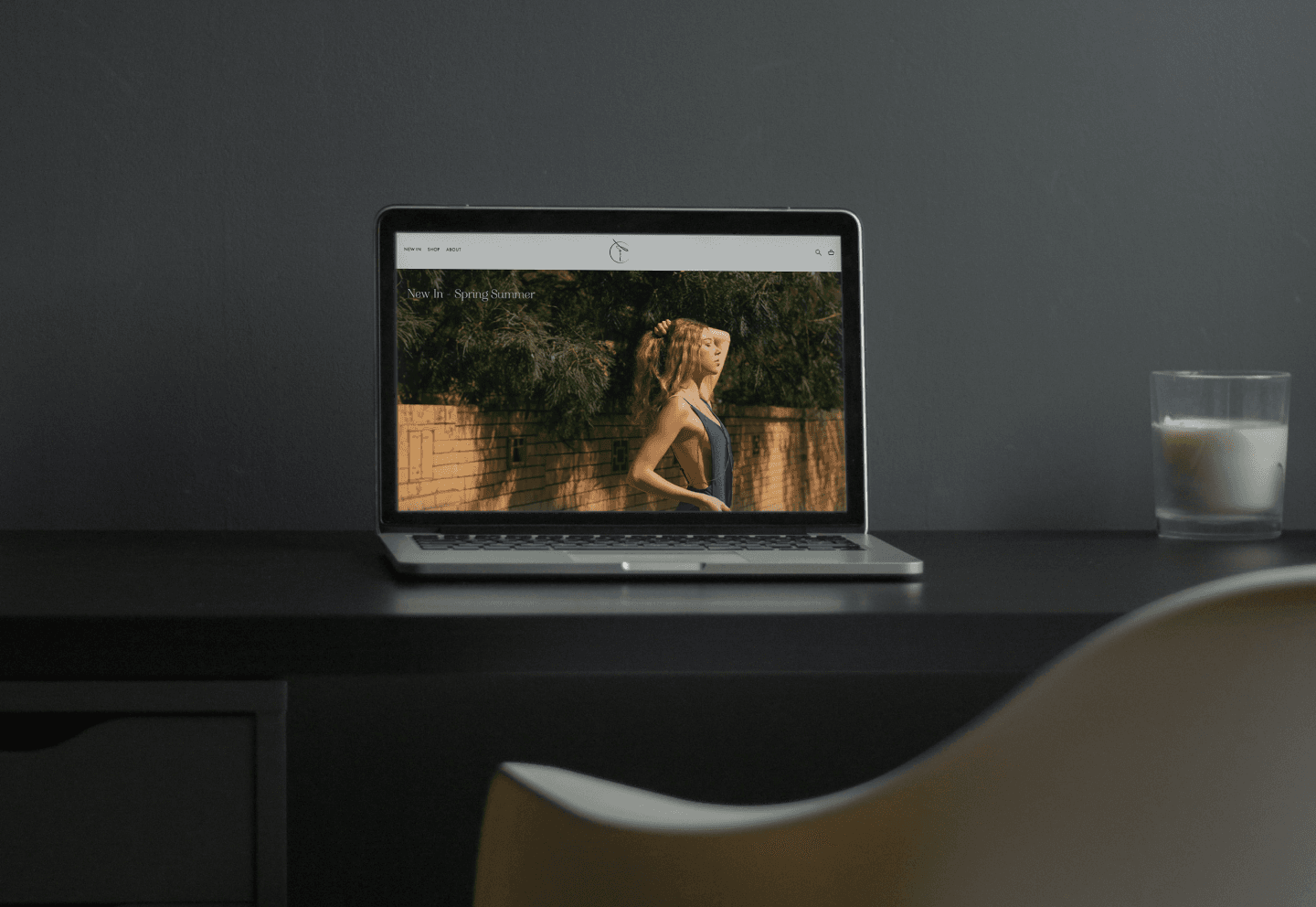
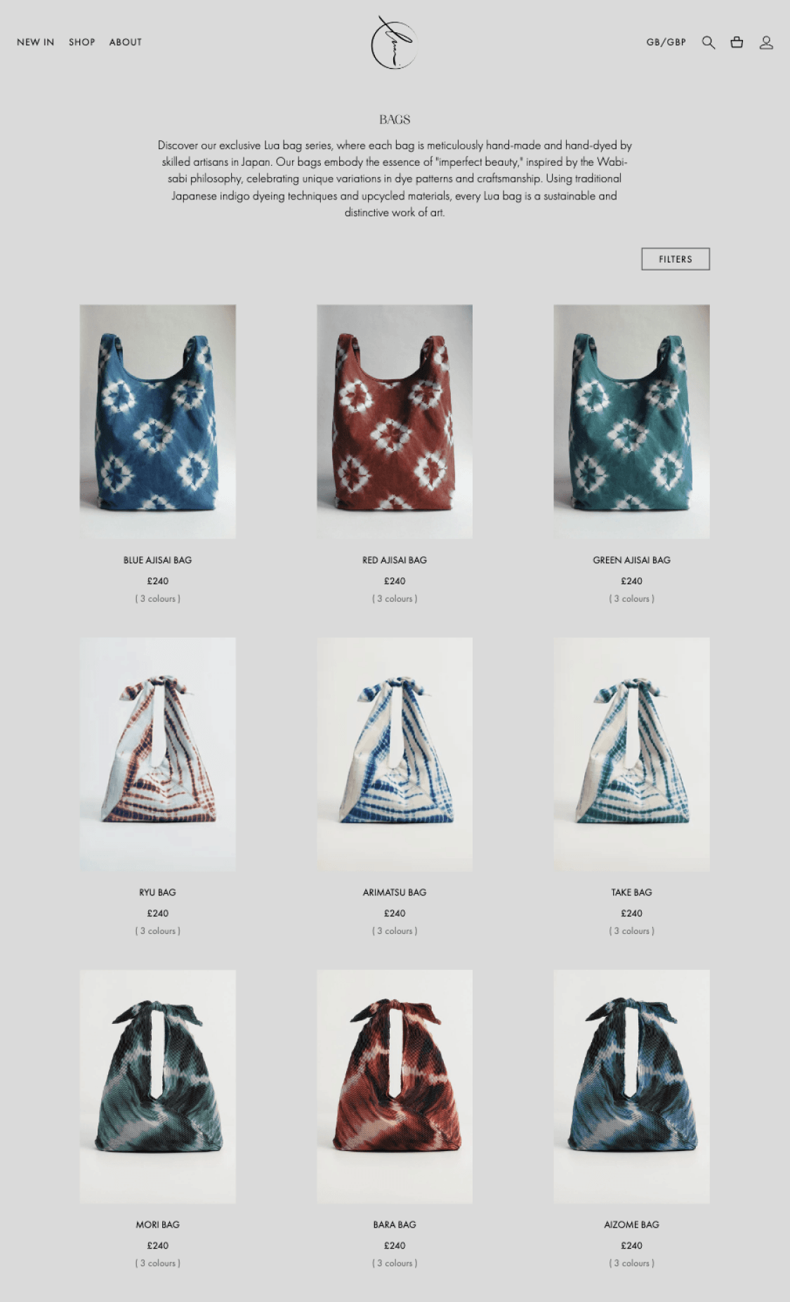
The eCommerce website, built on Webflow, combines elegance and functionality. The homepage features a refined layout and captivating imagery, while the Shop page includes interactive animations that highlight product craftsmanship.
Goals and objectives
Our primary goal is to develop a visually captivating brand identity and user-friendly eCommerce platform that effectively introduces Lua to the London market, while our objectives include creating an aesthetically compelling brand identity, designing an intuitive eCommerce platform, and enhancing customer engagement through captivating design and user experience.
Process
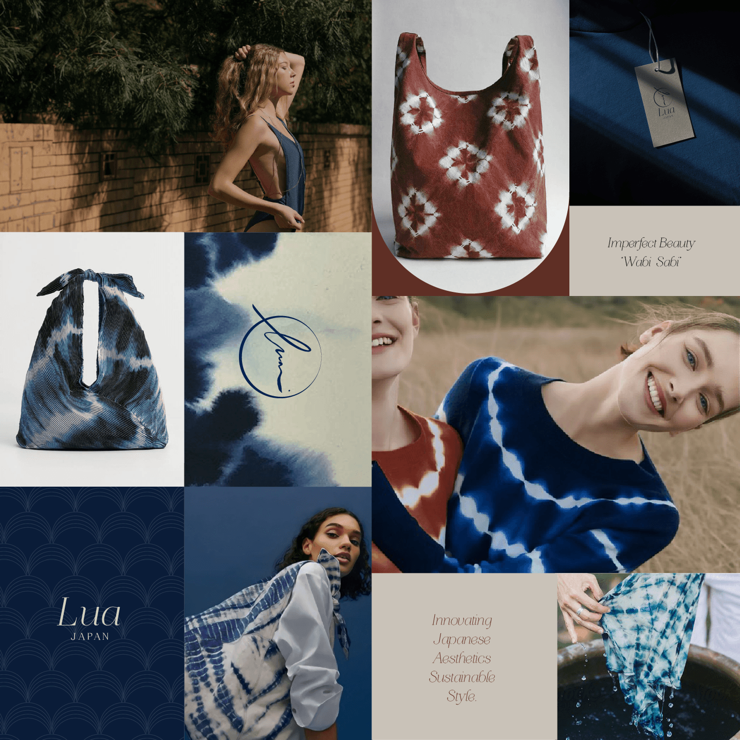
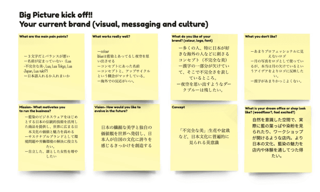
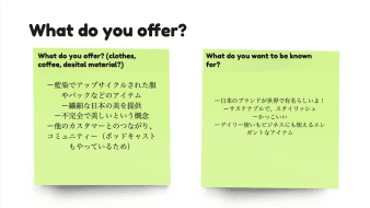
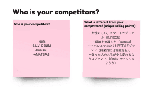
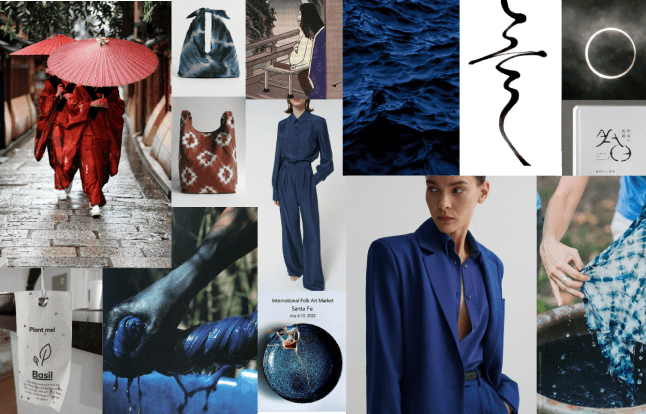
The project initiated with meticulous research, culminating in the creation of a comprehensive mood board. Subsequently, collaborative brainstorming sessions with clients ensued, dedicated to collecting diverse visual inspirations and conceptual ideas aligned with Lua's core principles of "imperfect beauty" and sustainability.
Brainstorming

Mood Board
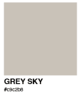
Colour Palette



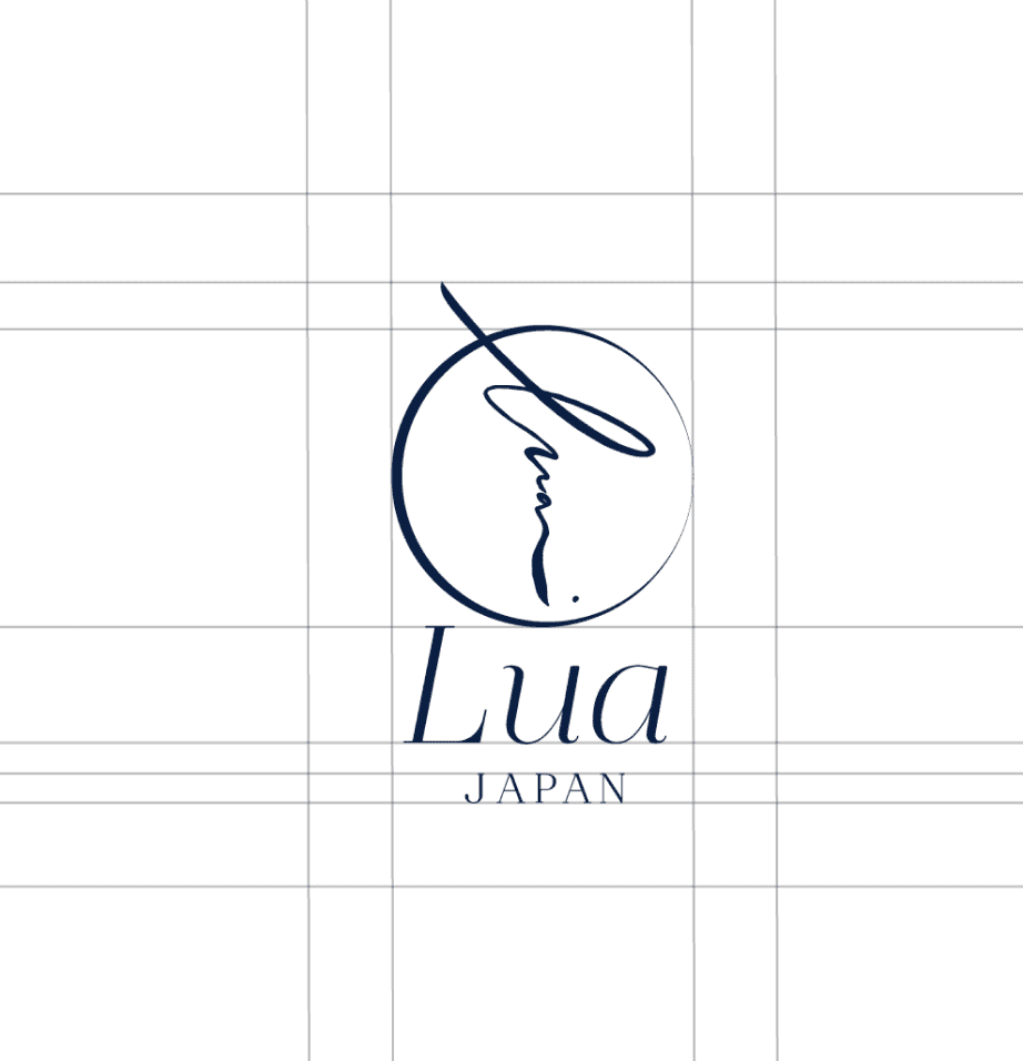
Logo Design
For Lua, the logo design reflects the brand's "imperfect beauty" concept and the Japanese wabi-sabi aesthetic. The circle with varying line thicknesses symbolizes natural imperfection which inspired by moon and Lua's circular business model, where clothes are reborn with indigo dye rather than ending up in landfills. The handwritten "lua" text conveys authenticity and craftsmanship. For the typeface, I chose a modern serif font to evoke traditional vibes while highlighting the unique way Lua inherits culture and tradition through upcycling. This design effectively communicates Lua's dedication to sustainability and craftsmanship, resonating with their eco-conscious audience.
Packaging Design
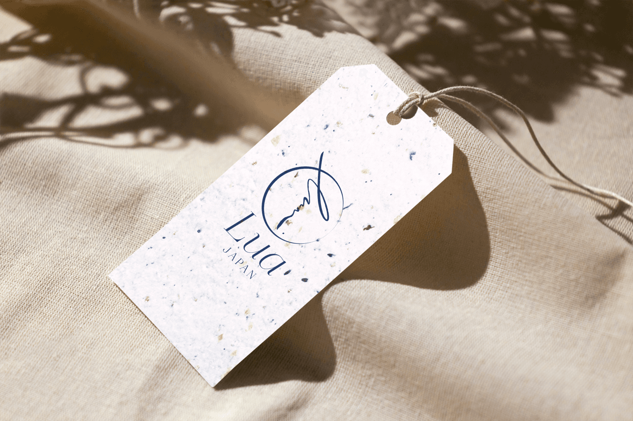
I chose to use plantable seeded tags, which customers can plant to grow various plants, adding an interactive and eco-friendly touch to the packaging. These tags symbolize Lua's commitment to sustainability and environmental consciousness, creating a meaningful connection with customers. For the shopping bags, I used eco-friendly paper, further emphasizing the brand's dedication to sustainable practices. This approach not only enhances the unboxing experience but also reinforces Lua's values and mission.
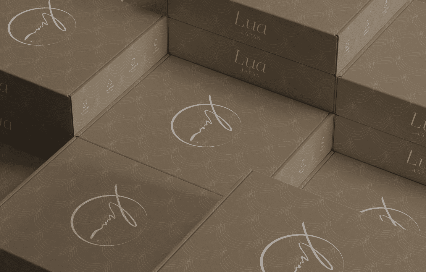
The cardboard packaging is designed with minimal color, predominantly white, reflecting a clean and sophisticated look that underscores the brand's dedication to simplicity and sustainability. The minimalist design not only reduces the environmental impact but also allows the beauty of the product to take centre stage.

Web Design
Our Lua eCommerce website, built on Webflow, blends elegance and functionality. The homepage features a refined layout with stunning imagery, designed to captivate visitors. The Shop page utilizes subtle animation effects, bringing products to life when you hover over them.
Challenges
Balancing the Logo: One of the major challenges was balancing the three-letter logo "LUA" to create a cohesive and aesthetically pleasing design.
Expressing Imperfect Beauty: Capturing the essence of "imperfect beauty" within the logo design was a complex task, requiring a delicate balance between elegance and imperfection.
Material Constraints: Working with upcycled and eco-friendly materials posed constraints, especially given the brand's strong commitment to sustainability.
Minimalist Design: The minimalist design approach, with limited colours and sustainable materials like seed tags, demanded high levels of creativity to maintain visual appeal and brand consistency.
Outcomes
Successful Logo Design: The final logo, featuring a handwritten style and imperfect circle, effectively conveyed the brand's philosophy of "imperfect beauty" while incorporating Japanese aesthetics inspired by the Seigaiha pattern, symbolising the beauty of unique, ever-changing ocean waves.
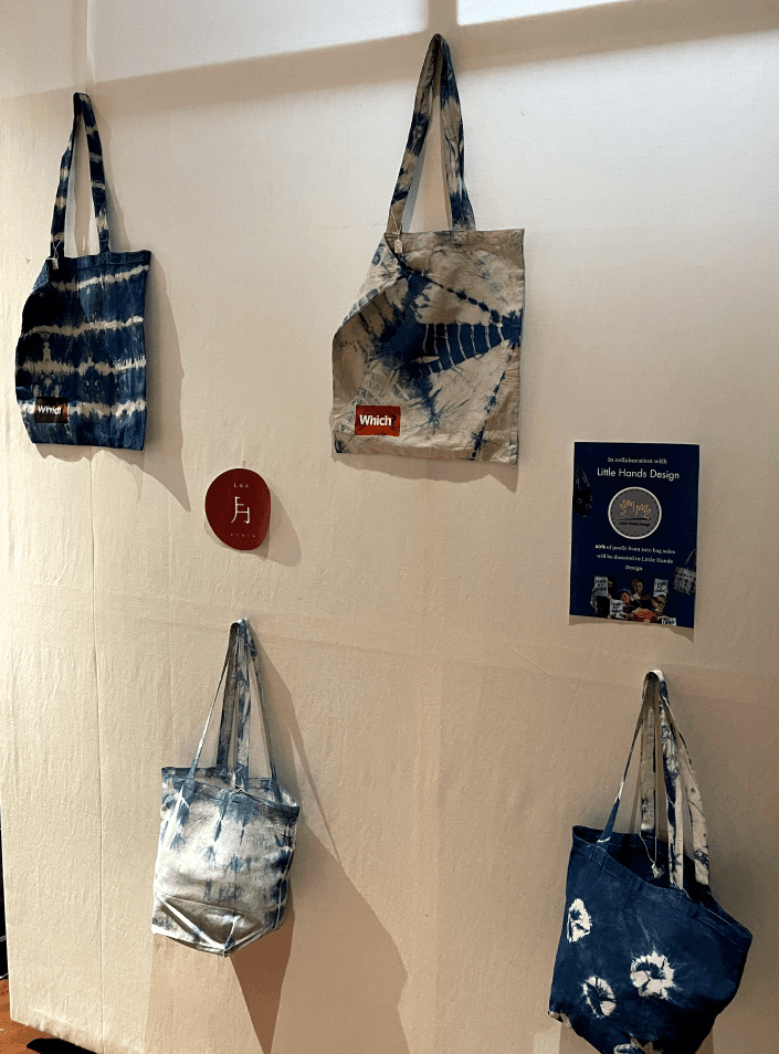
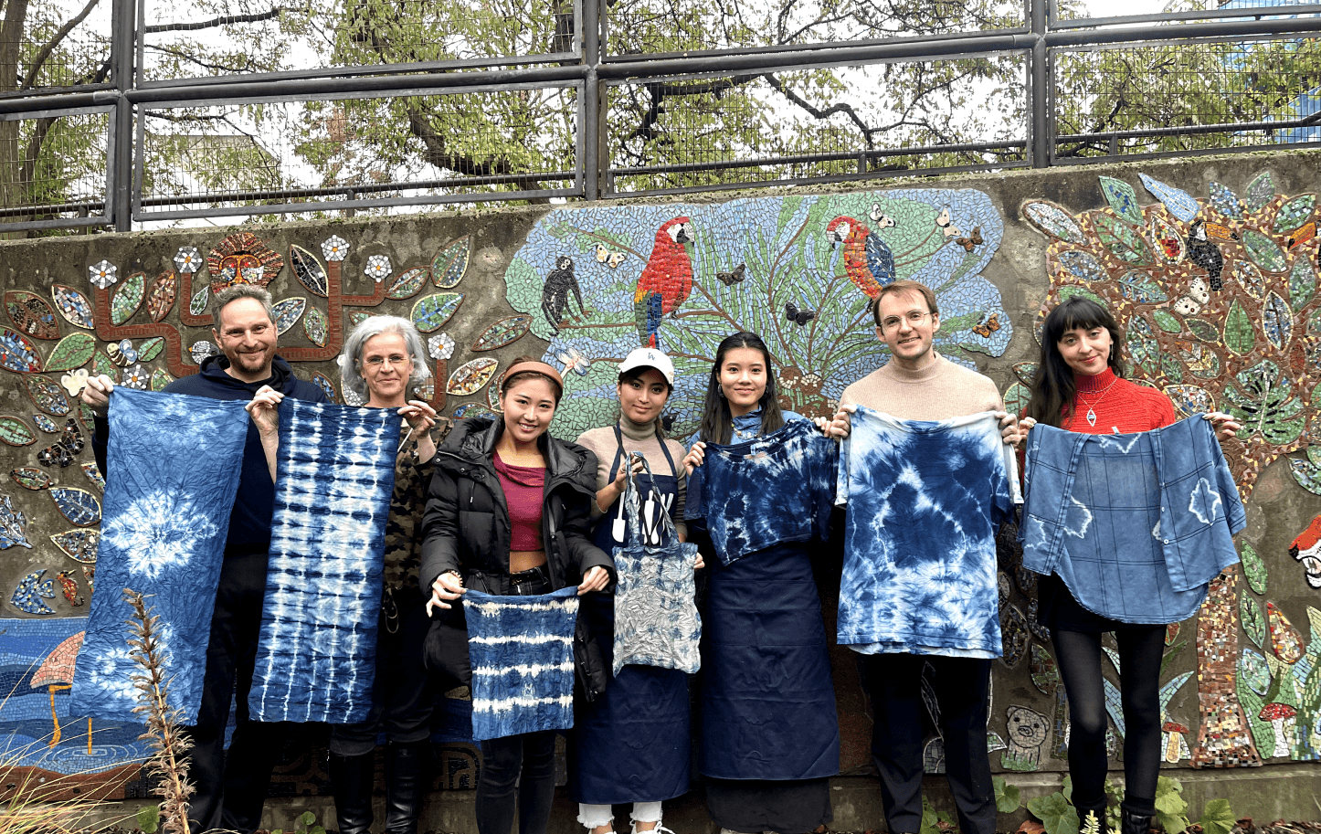
Market Launch and Events: Lua successfully launched in London, holding pop-up events and workshops that showcased the brand's unique approach and engaged the local community.
Effective Market Entry: Leveraging my knowledge and experience as a designer in London, I was able to help Lua enter the market successfully, enhancing their brand identity and expanding their reach.
Chat with me!!
Interested in working together? I'm eager to hear about your project ideas and discuss how we can create stunning designs that bring your vision to life. Reach out now to start a conversation!